Why Good UX Designers Should Play Video Games (Part 2)
What you can learn from video games to make your designs more forgiving, reinforce behaviours you want, and how to not make your application into a maze.
In the last part we saw what we can learn from the way video games onboard users, introduce new elements, and create predictable patterns which users can use to make the most of their experience.
Let's look at a few more of these nuggets.
Skill Curves / Casual Users vs Power Users
Remember Mortal Kombat? 4 simple actions - jump, crouch, kick, punch. As a beginner, you can mash the buttons enthusiastically enough to scrape a win.
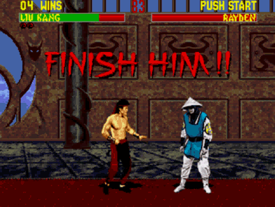
A game released in 1992 figured this out, so you really have no excuse.
However, press those buttons in just the right sequence -- and you get a combo. A stylish move which deals more damage, and makes you look cool while you do it. That precise timing, and memorizing all those combos comes with time you put into familiarizing with the game.
The game won't punish you for not being a pro. But it will scale to accommodate you when you become a badass.
Let's look at Excel once again.
A college student would be able to use it, clicking around to move between cells, click around for basic functions like sums, differences, averages, etc.

"I've heard he can work on Excel without using the mouse at all"
A hardcore accountant, on the other hand, would be able to belt out a full-fledged report (amazingly quickly) without ever touching the mouse.
Keyboard shortcuts, handy power-user tricks, advanced functionality, all serve towards this purpose. Each application may have its own version of this. These aren't always presented to the user upfront, as it would overwhelm them while starting out. But they're always accessible, should your curiosity arise.
Coyote Time / Tolerating User Errors
Ever had that jump in Super Mario where you jumped right at the edge of a platform, but the game dropped you down as if you didn't?
No you haven't. Don't make stuff up.
Because these games implemented something called Coyote Time.
Get the reference?
How it works is by adding an extra bit of invisible platform at the end of what you see. So in case you jump a little too late, that extra platform will prevent you from falling to your death, and the jump still works.
Similarly, Metal Gear Solid gives you a second of slow-mo when you're detected, to take down the enemy who's about to raise the alarm.
So how does this translate into UX?
What you're doing here is making your design more forgiving. You're accounting for a potentially common error.
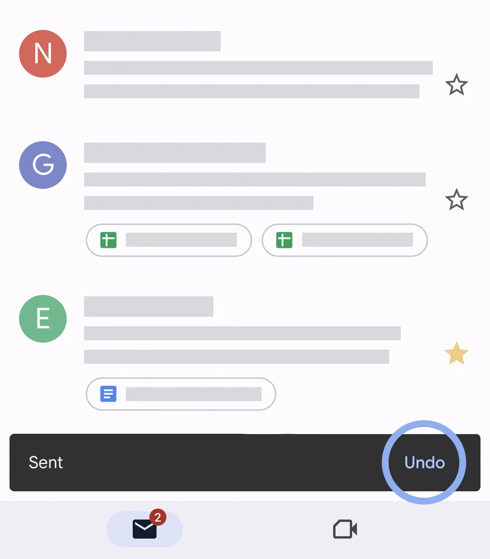
Google noticed how many times people accidentally send emails before they've finished writing them. So Gmail got a time-limited Undo button for Send, Delete, and Archive, saving heaps of potential embarrassment for everyone using it.
Is your user trying to do a destructive action? Make them confirm it.
Is your user making a purchase? Show them an overview of the order with the details.
Don't punish your users for making a mistake.
Positive and Negative Feedback Loops
Hitman is a game where you play as Agent 47, a legendary assassin with boogeyman-level skills. You can either play in a way you live up to that legendary status, picking off your targets like a ghost who was never there, or you can play like Rambo.
Take a guess which way the game is meant to be played.
But, the game doesn't punish you for going Rambo. Sure, it'll make things difficult. You die pretty easily if shot. But it won't instantly fail the mission if you're detected (looking at you, Assassin's Creed, with your annoying tailing missions).
Instead, the game rewards you for being stealthy, and playing it the way it was meant to be. This comes in the form of a higher score, unlockables, and achievements.
Positive reinforcement. Neat, eh?
What can we learn from this?
Encourage the behavior you want, instead of discouraging the behavior you don't want.
Of course, there are right and wrong ways of doing this. You don't want to be Candy Crush. I believe as designers we're obligated to not use underhanded or unethical methods to get users to come back again and again. You want to make something engaging, not addictive. But that's a topic for another time.
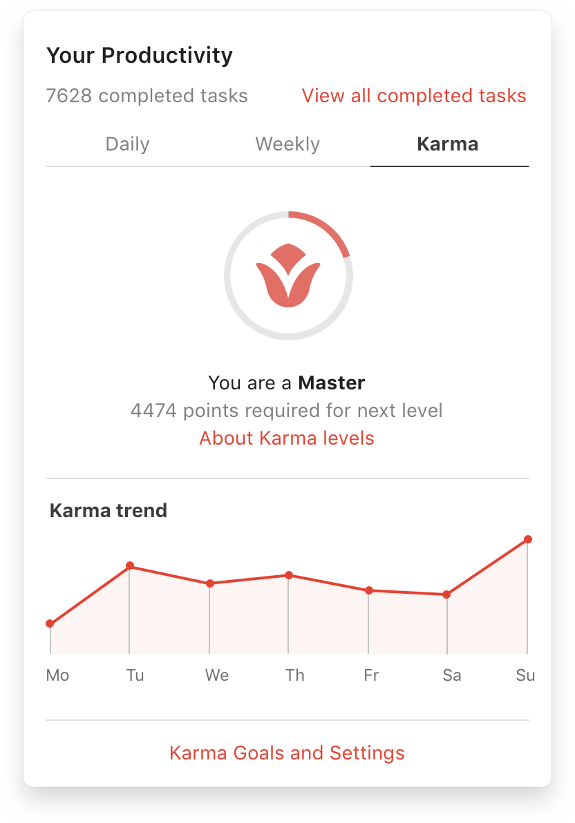
A good example of this is what Todoist does with its Karma system. Completing tasks gives you karma points. As you accumulate more and more karma, you rise up in "levels"; 8 of these levels, from Beginner to Expert to 'Enlightened'.
See? Todoist essentially gamifies using the app to complete your tasks, without making it the reason you're coming back. The encouragement works as positive trigger which makes you feel *good* about using the app.
Why Uncharted doesn't need a compass
Uncharted is a game where you traverse ancient ruins and scenery to get to places and find things. The game, however, doesn't tell you where to go.
Uncharted, the Half Life series, and The Last of Us are notorious for not including a map or compass or waypoint markers on the screen. And yet, you'll know. Check this out:
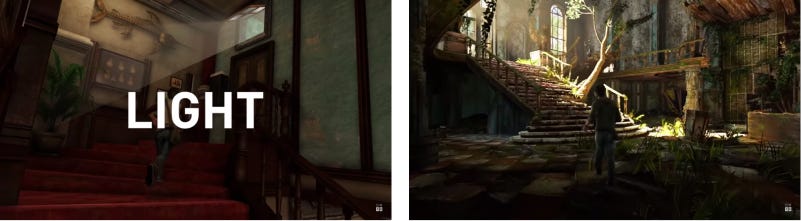

The games use things like contrast and lighting to give you subconscious clues for things to move towards, like some GPS Jedi.
Disneyland does this too, by the way, to move you around the park.
As Naughty Dog's Lead Game Designer Emilia Schatz puts it, "It's all about what your environment is telling the player".
Similarly, you have to pay attention to what your interface is telling your user.
If you want to drive your user along a certain path in exploring your application, you have to ensure your design flows accordingly. Using color and size to draw users' attention to the things you want, you can nudge them to take the actions you want them to try out. Remove the clutter, make the next action obvious, and keep it in a place the user is going to look.
Wrapping up
All of this sounds like common sense, doesn't it? And yet, way too many designers make these mistakes, and can't pinpoint what's going wrong -- because yeah, user research isn't always going to tell you that. Especially if you don't know what you're doing.