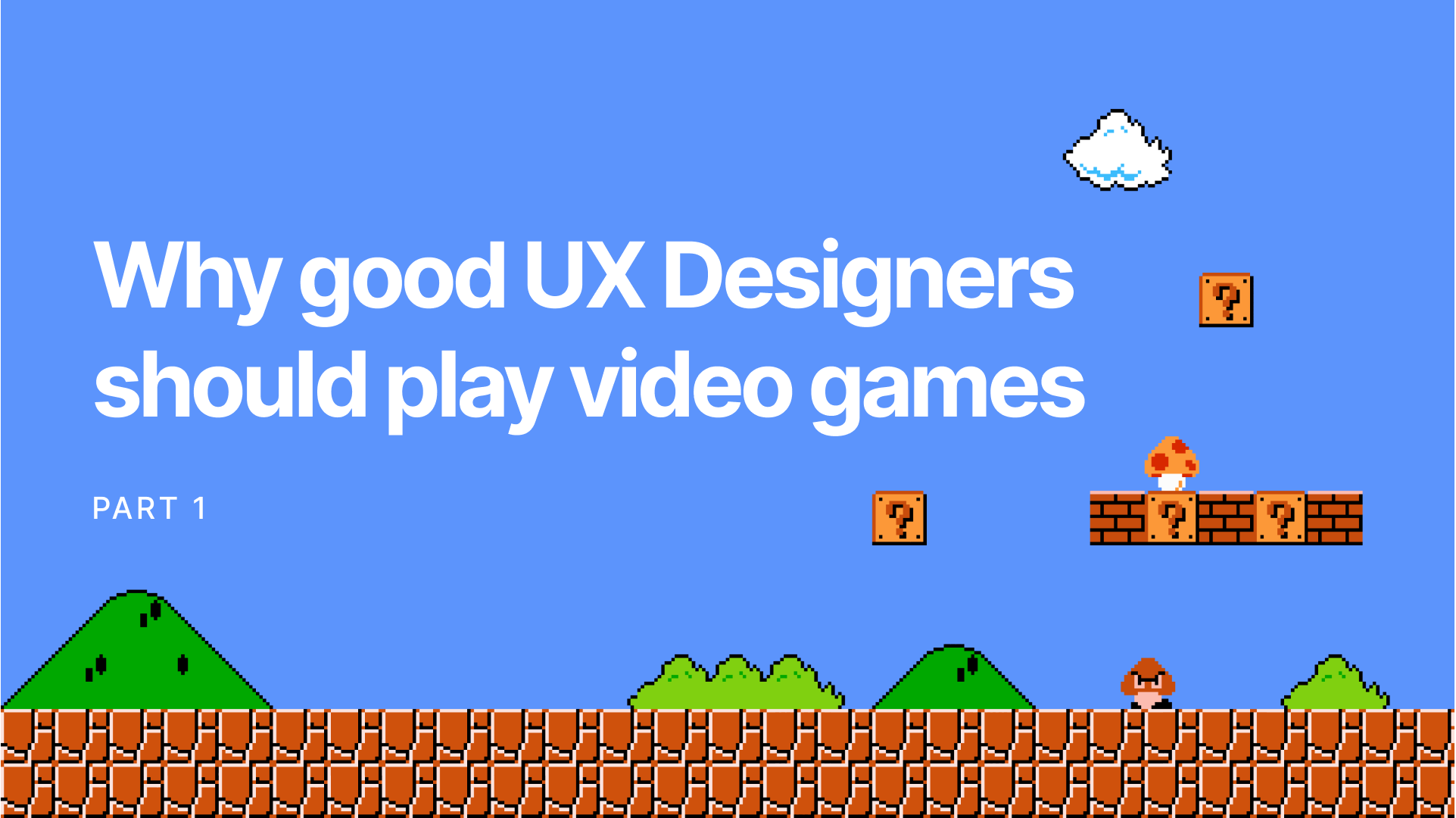
Why Good UX Designers Should Play Video Games (Part 1)
Super Mario, Halo, Uncharted, and more. Video games have often come up with the most intriguing solutions for user experience. Here's what we can learn from them, beyond 'grenades go BOOM'.
Okay, I don’t mean it like “to kill time while Adobe XD updates”. I mean, learn from them.
Yeah, learn from video games.
Don’t snort in derision just yet. Hear me out. It's gonna get nerdy.

It's about to get crazy
Baby Steps / Onboarding
Whether it’s fast-paced action or a gripping storyline or both (Uncharted, you beauty), players don’t have the time or patience to understand complex mechanics, no matter how lovingly designed.
Think back to the days of Super Mario.
You start with an idyllic countryside in the background. As you move right (obviously), you see the first floaty-floaty brick for our Italian plumber to headbutt. Curious, you tentatively jump. Ah, the sweet *ding* of your first coin collected.
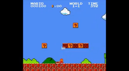
Mario eats a mushroom and becomes Super
A little further ahead, you get your first mushroom. Oh, you’re bigger now. Neat. You see your first enemy. You instinctively jump over it. But 8-year-old you isn’t that coordinated yet. You touch the enemy. But that’s okay, the game says - it’s not punishing you. It’ll let you continue playing. It’ll just make you smaller again.
8-year-old you could probably handle Worlds 1-5 no problem.
Imagine, if instead the same made you start right back from the start of Level 1 when you died. 8-year-old you would be very, very annoyed.
The point of this long-winded anecdote is how applications we design should handle onboarding. The reason games like Super Mario, Tomb Raider, Halo, etc. were so popular is that they were super effective in allowing even the newest players to enjoy the game. They didn’t assume you knew everything, and they didn’t overwhelm you by throwing everything at you at once.
They held your hand as they took you through the basics, all while keeping you in the game, not a dumb tutorial level.
Take Duolingo for example. The app has become a sensation due to its exceptionally accessible UX, especially the onboarding.
Key takeaway:
Don’t overwhelm your users with instructions.
- Give users an easy way to jump back into the task if they make a mistake.
- Don’t punish users for getting things wrong the first time.
Speaking of which —
Sandboxing / Introducing new features
Let’s look at Half Life 2 as another example. Every time a new enemy is introduced, the game first shows it to you from a safe distance, with the means to dispose of it.

For example, right before you first encounter the zombies, you enter a room to see a sawblade stuck in the opposite wall, pinning a zombie chopped in half with it. As you pick up a sawblade to move it out of your way using your Gravity Gun (the game already having shown you how to do that), a zombie shambles in front of you unexpectedly. You reflexively press the trigger, and the sawblade launches ahead, chopping the zombie in half. That’s the Petyr Baelish level of manipulation through which the game shows you the best way of dealing with the zombies.

Key takeaway:
Consider providing your users an intuitive example of how a feature can be used, without making it an intrusive tutorial.
Immersive Gameplay / Heuristics (a.k.a. setting expectations)
When Halo: Combat Evolved was released in 2001, it revolutionized first-person shooters. For example, players no longer had to cycle through their whole inventory to select a grenade, aim it, and then throw it. Instead, just hit one button, and the Master Chief would lob one wherever you were pointing.
This pioneered the gameplay mechanics for generations of games which would come after it.
Sounds similar?
That’s the genius of the game designers identifying a routine action, and simplifying it so the user can focus on tactical gameplay rather than fumbling with their keyboard for a simple action.
Heuristics extend beyond “Delete should be red”. These design patterns, through repetition and prevalence, have let the users know what to expect. So when something doesn't behave the way they expect, that creates a point of friction.
This plays out in 2 parts. Setting expectations, and then ensuring those expectations are met every time. At the very least, don’t do this:
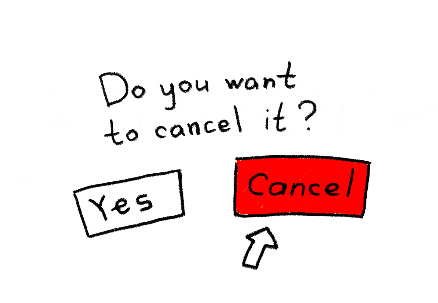
So you see, consistency goes beyond "all my buttons are the same size". Your product has to behave consistently.
Imagine you're playing Skyrim, a game about dragons and magic set in a medieval pseudo-Nordic world, when suddenly, Thomas the Tank Engine rolls up in the hood.

I used to be a steam engine like you, then I took an arrow to the axle.
That’s what the gaming nerds call immersion-breaking.
The example is exaggerated, but you get the point.
Emergent Gameplay / Consistent Behavior
When left to their own devices, players will form their own strategies/tactics for achieving their objective. For example, whether to clear out this next enemy camp like Rambo or like a stealthy ninja.
But to do that, players have to be able to predict how each element of their plan is going to behave. Good games handle this masterfully.
Take Halo for example. The lowly Grunts will almost always run away to their squad terrified when they see you or if their Elite commander is killed.
As every stage of this interaction occurs, the Grunt’s status of surprise, panic, and consequent pandemonium is clearly telegraphed. This behavior is more or less consistent throughout the game. This allows players to plan their actions accordingly and perfectly time their move. Pinned down around a corner? Chuck a plasma grenade at a Grunt and watch it run towards its friends, taking them all out.
Now, imagine if an “Add” button in an app behaved differently on every other screen. Your user wouldn’t know what to expect, and would be unpleasantly surprised every single time. Until they eventually get too frustrated, uninstall your app, and if they’re having an extra-bad day, also give you a 1-star rating.
Look at Excel. It doesn't create "user flows" for every imaginable workflow. It gives you the building blocks. Ensures they behave consistently so you know what they're going to do. And then like a good Desi dad, sets you on your way to do your thing with that knowledge.
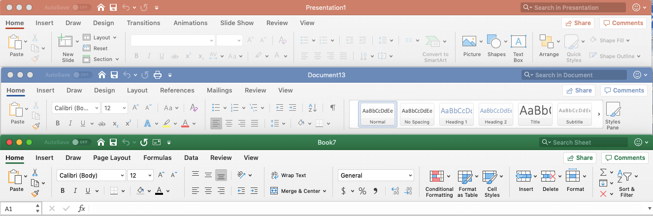
Microsoft’s header bars are identical for Word, Excel and Powerpoint so users can switch between the three applications seamlessly. Source: PlaybookUX
Sure, you won't see it brag about winning a design award. But that's the thing. Good design is invisible. It just works.
Key takeaway:
- Creating consistent, predictable behavior where expected allows users to focus on getting the task at hand done in the way that’s most effective for them.
- Create consistent behaviors with your interface to minimise unwanted surprised and confusion for users.
- Borrow from heuristics from existing interfaces that users interact with in their daily life to minimise the amount of learning required for your UI.
- Visibility of system status is important to keep the user informed of what’s going on.
In Part 2 —
This would end up being a loooooong read. So I decided to split this into parts. That way, if I figure out more things from video games in the future, I can just add another part (scalability, eh?)
In Part 2, let's have a look at —
- How video games protect players from themselves
- Positive and negative feedback loops
- Why Uncharted doesn't need a compass
- Coyote Time